Everything happens at once.
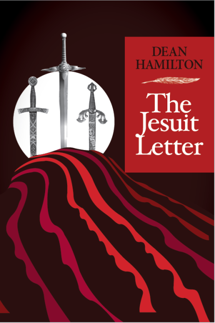
No sooner do I receive the edited version of The Jesuit Letter back (laced and scarified with editor's cuts, slashes & corrections), then my designer drops the new cover concept drafts into my hands.
I was expecting maybe 3 to 5 concepts, and she came back with 15! Admittedly a number of these are all variations on a specific concept but still, it was a cornucopia of concepts.
In the interest of aiding my decision, I thought I would throw these up on the Interweb and social media for direct feedback and commentary. Let me know favorites, what you think, what works, what pops and what doesn't. Any preferences, thoughts or helpful comments would be greatly appreciated!
By way of background, The Jesuit Letter is historical fiction, with a bit of mystery/thriller mix, set in Elizabethan England in 1575.
Here are the concepts:
Let me know what you think! Thanks!
Elizabethan London
Tyburn was an infamous execution spot west of London, used since medieval times. The Tyburn "tree" - a unique, multi-person gallows - erected in 1571 became a popular public spectacle, drawing crowds of thousands.Tyburn Tree blog is less blood-thirsty but hopefully topical, interesting and informative, if slightly bent to my personal topics of interest - books, writing, history, technology, with a smattering of politics and dash of pop culture, science and the downright strange. So "take a ride to Tyburn" and see what happens...
Thursday, October 2, 2014
Jesuit Letter Cover Drafts
Labels:
art,
book,
book covers,
design,
elizabethan,
fiction,
historical fiction,
historical ficton,
publishing,
Writing
Subscribe to:
Post Comments (Atom)


I think I like the first one the best; seems clean. The one with the Queen and the others with buildings look too much like a history book, and it doesn't read that way, so no need to put off potential readers. I have to say I am influenced by a cover to at least read the flap.
ReplyDeleteSecond choice is the one with the sword stuck in the table. Conveys more of the adventure and intrigue in the book.
Gary Slye
i like number 1. my favorite - and the most eye-catching for me. don't cheapen your book with a few of these covers, bleach
DeleteLooking down from the top, I'd go for 1, 14, 12, 6 in that order. I heard somewhere that people are also more attracted to lighter coloured covers - not sure how true this is.
ReplyDeleteSome great choices here! My preferences (in order) #1, #2, #11
ReplyDeleteGreat progress!
I agree with everyone so far--number one is by far the best, clean and evocative. Many of the others look too "on the nose" and a few are actually kind of cheesy, which I think undercuts the book.
ReplyDeleteCovers 1 and 9 look the best options of what is available. I would amend them slightly as:
ReplyDelete1. The parchment with the seal looks good with the cross overlapping the 'U', bring the author name down closer to the title and make it bolder;
'9. The ornamental dagger pointing to the sealed letter looks good, only 'brighten' the characters in both the author name and title, make them stand out more otherwise they stand to recede into the background. Introduce white or better still a light buff colour (like parchment) to the centres of these characters.
Now stand back and make up your mind. My preference is 1.
Alan R L
I actually like #9 the best, with #1 or #2 as a close second. The problem with 1 or 2 is that they may be too plain to attract a reader if this is sitting on the shelf. Also, really doesn't provide any hints as to the genre of the book, whereas #9 really speaks to the suspense and intrigue that you may want to convey to prospective customers. Good Luck!
ReplyDeleteI like top one.. I would, however do your name in red letting or banner like #2 to help it stand out.
ReplyDeleteI like #1 but with changes: from #2, the author's banner on top, and the yellowed parchment paper and straight lines of handwriting. Caught my eye right away, clean lines, and I KNOW it will be an interesting book!
ReplyDeleteI very much like #1, and also #11.
ReplyDeleteDean, I like 11 and 14. The images suggest a lot, with the color red indicting mystery and perhaps mayhem
ReplyDeleteI like the first one the best. The one with the skulls looks too macabre for my taste and would turn me off. Also the ones that indicate blood. But number one looks interesting and I would pick it up to look at it.
ReplyDeleteThe first one is best, but hard to read in a smaller image (like the one on Linked In) because the cross is placed on top of the U. If it could be placed within the U so the word Jesuit is clear I think you would have a winner.
ReplyDelete#1, #2, #10, #11
ReplyDeleteWho is your designer? I'd like to use her.
I like the bolder colors of #2. The ones with the picture of the house make it feel like a biography. #11 gives you more of a sense of the thriller with the drops of red around the seal and the swords. This is always a hard choice, I agonized over mine for days.
ReplyDeleteI like 2, 9, 11
ReplyDeleteAll coming together :)
Either of the first two, with an emphasis on design #1.
ReplyDeleteNumbers 1, 2 and 9 work best for me. Some of the others kind of look like covers for comics?
ReplyDelete#1 attracted my attention from the beginning, #3 - #7 were not suitable, in my opinion.
ReplyDelete