Elizabethan London

Elizabethan London
Tyburn was an infamous execution spot west of London, used since medieval times. The Tyburn "tree" - a unique, multi-person gallows - erected in 1571 became a popular public spectacle, drawing crowds of thousands.Tyburn Tree blog is less blood-thirsty but hopefully topical, interesting and informative, if slightly bent to my personal topics of interest - books, writing, history, technology, with a smattering of politics and dash of pop culture, science and the downright strange. So "take a ride to Tyburn" and see what happens...

Thursday, August 23, 2012

“It was a dark and stormy night...

It is time again for reams of deathless prose to fall trippingly and winningly (agitatingly even...) onto the page. It is time to read, nay, to declaim with unadulterated joy, the best and most articulate expression of literature that the world, dare I say it, has ever beheld.

In short, the results for the 2012 Bulwer Lytton Competition are in.


Edward George Bulwer-Lytton was the author of Paul Clifford (1830), a book widely remembered and oft-cited for it's florid opening passage:

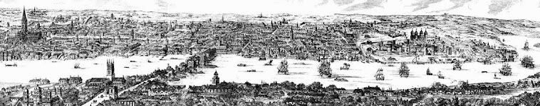
“It was a dark and stormy night; the rain fell in torrents — except at occasional intervals, when it was checked by a violent gust of wind which swept up the streets (for it is in London that our scene lies), rattling along the housetops, and fiercely agitating the scanty flame of the lamps that struggled against the darkness.”

To honour writers of purple prose everywhere, San Jose University has sponsored the Bulwer-Lytton Fiction Contest since 1982. Thousands of entries are submitted each year, the best of which are selected as finalists and winners for a variety of categories. Earning a nod from the Bulwer-Lytton judges requires a substantial dive into a deep, deep well of sublime, ear-bleeding prose...

Here is the 2012 Grand Prize Winner:

"As he told her that he loved her she gazed into his eyes, wondering, as she noted the infestation of eyelash mites, the tiny deodicids burrowing into his follicles to eat the greasy sebum therein, each female laying up to 25 eggs in a single follicle, causing inflammation, whether the eyes are truly the windows of the soul; and, if so, his soul needed regrouting." - Cathy Bryant, Manchester, England

You can find the many category winners and finalists listed on the Bulwer-Lytton site, it is well worth a look.

My personal favorite - the Crime Fiction winner:

"She slinked through my door wearing a dress that looked like it had been painted on … not with good paint, like Behr or Sherwin-Williams, but with that watered-down stuff that bubbles up right away if you don’t prime the surface before you slap it on, and – just like that cheap paint – the dress needed two more coats to cover her." - Sue Fondrie, Appleton, WI

and the Dishonorable Mention winner (I just can't resist):

"Inspector Murphy stood up when he saw me, then looked down at the lifeless body, crumpled like a forlorn Snicker’s candy wrapper, and after a knowing glance at Detective Wilson pointed to the darkening crimson pool spreading from the stiff’s shattered noggin, and said, “You settle it, Gibson; does that puddle look more like a duck or a cow?” - Carl Stich, Mariemont, Ohio

Bravo!

Wednesday, August 15, 2012

"Slow beats the time-worn heart of Mars..."

If the Olympic excitement has been distracting you, you might want to take note of this spectacular and astounding moment in history - the amazing success of the Curiosity Rover. 

Curiosity is part of NASA's Mars Science Laboratory, a long term series of robotic exploration mission of the red planet.  Curiosity itself is a large mobile laboratory with a payload ten times that carried by previous rovers.  Designed to roam the surface of Mars for at least a full Martian year (687 days), Curiosity is equipped with 17 cameras, a laser spectrometer and sample collectors (among other testing equipment) and is designed to test the Martian soil for potential signs of microbic life.

Curiosity successfully landed last week utilizing a spectacular and terrifying deployment system that combined reentry, parachute deployment and then a final descent via a tethered "sky-crane", a new and innovative landing deployment that had never been attempted before.

Essentially JPL and NASA have landed a rover the size of  mini-Cooper on a planet more than 85 million kilometres away.
Curiosity is currently situated in Gale Crater, a massive 154 km wide crater estimated to have been created 3.5 billion years ago.  The exposed terrain of the crater will allow Curiosity a full view of the range of Martian geology, opening a window into the planet history.  The image to the right (courtesy of NASA), shows Curiosity on the surface of Gale Crater.

For a look at the surface, where Curiosity is currently, I highly recommend clicking on the link for a look at the incredible and immersive panorama that Andrew Boderov stitched together at 360 Cities blog.


Monday, August 6, 2012

Coverspace

Several months back I used Lulu.com to pull together some reader copies of The Jesuit Letter that I could distribute to people and get feedback on the book.

Aside from discovering that no matter how much editing I do, I still manage to find additional typos right after having 10 copies printed....I found myself noticing and attending more carefully to the role of book covers.  The cover I pulled together for The Jesuit Letter was literally just that - pulled together from a couple of off-hand images I had and dropped onto the Lulu template...but this was a for a set of personal reader copies, not for sale or appeal to a wider audience, so I spent very little time considering what to incorporate.  Not being a designer and using a very limited Lulu template, the cover is alright for the use for which it was intended.

But it certainly doesn't do the job it should.

The saying "you can't judge a book by its cover" might be nominally true but I suspect much of the time you can and do judge a book by its cover.  A powerful, interesting or evocative cover can catch the eye and set the tone for the book.  It is, I suspect, an essential component in determining if someone browsing in a bookstore, library, or online, decides that this particular volume merits a closer look.

Certain book covers tend to stick in the mind and help build a compelling and intriguing picture of the book and the story for the reader.  So what works in a good cover? 

It is fundamentally subjective to the reader but there are a number of key elements that are oft cited on design sites.  The basic rules of cover design seem to boil down to the following:

Clarity - A cover should reflect the identifying points of the genre - for example, a reader should be able to easily distinguish between a western vs. a romance or a horror novel (although there may be overlap if the story has elements from multiple genres or crosses genres).  Recognizable identifying points provide context for the reader and help them distinguish the type of books that they are looking for.  They will recognize and cue on the key cover elements.  Romance novels would be nowhere without the pair of entangled lovers to instantly cue in the reader to the torrid promise of the story inside.

Visual integrity - The colours, font, images layout and style need to be an integrated design.  A lack of visual integrity results in a design that may be discordant or incoherent, lacking the strength of message and recognition that you want the book cover to convey to readers.

Expression & Information - A cover needs to express what the book is about or unique and important elements of the story.  This may be the setting, the characters, plot, motvivaton or critical event (i.e. a murder, a prizefight, a fishing trip etc).

Differentiation and Emotion - The cover needs to strike a balance between the recognizable cover elements that readers are familiar with, and provide an emotional appealling point of differentiation - something that makes that particular cover stand-out from the twenty others surrounding it on the bookshelf.

Ideally all of the above elements are integrated into your design to ceate a compelling and interesting whole that readers will find impossible to resist.

So what covers work?  As noted, everyone's tastes are very subjective.  Here's  short sampling of several that stuck in my memory:


Looking for more insight or info on what type of covers work?  Five minutes on Google uncovered a vertiable cornicopia of book cover information.  For starters, visit The Book Cover Archive for a terrific compilation of exceptional book design covers.

For a self-publishing writer, the best approach would be to examine and analyze covers from your genre, ideally bestsellers or similar books that generated buzz, and see what elements of their covers worked for you.  Breakdown what elements worked for you and why, and try to see how the cover designs attracted your interest or attention (i.e. colour, typeface etc.).  Once you have an idea of what approaches seem to generate the more positive response, you can start to think about what your cover needs to reflect.

Then tell your designer.