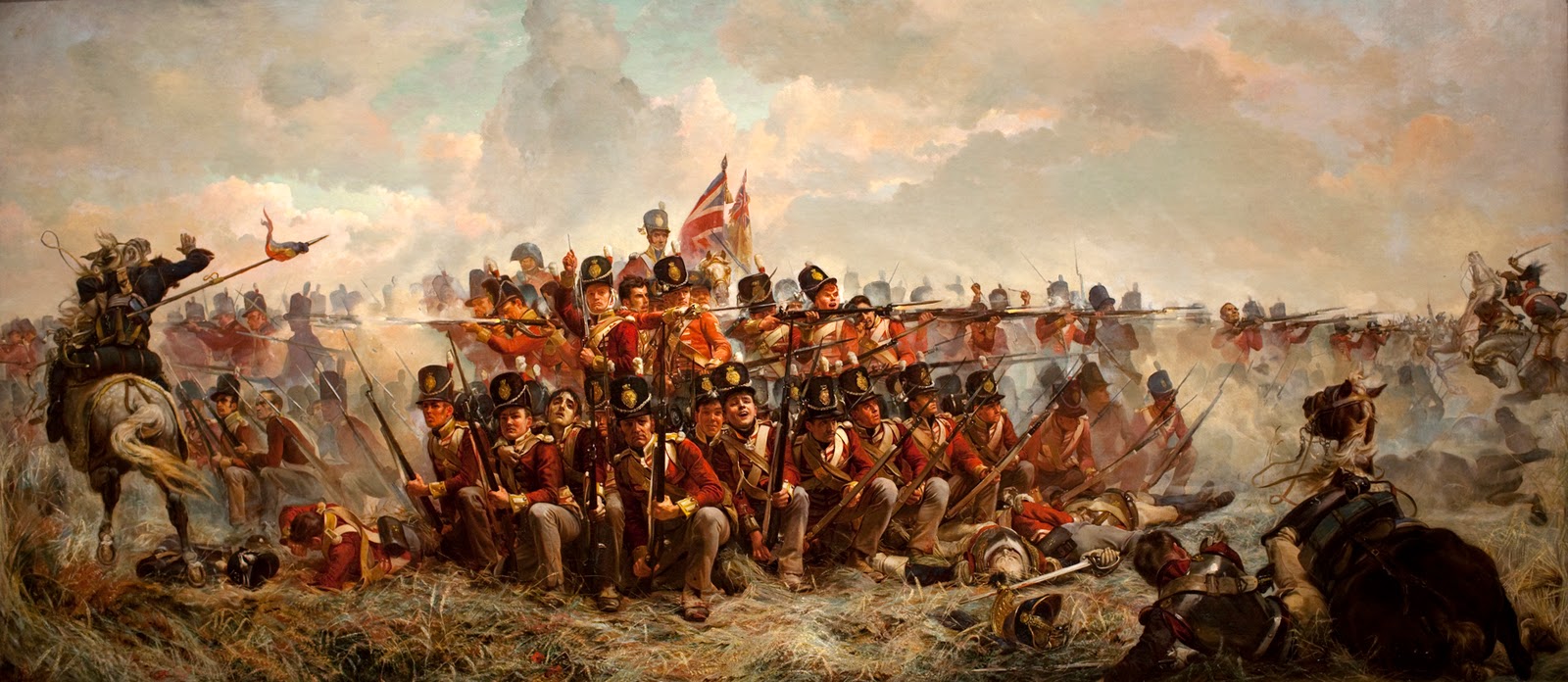
I get genuinely excited about things like the recent 200th anniversary of the Battle of Waterloo, or some new bit of Elizabethan slang that I run across. I am more than capable of boring the Hell out of people at parties.
It drives me to wander cities I visit, in an effort to retrace history and to trace the steps of all the ghosts that permeate the place. I went to Paris in my teens on a school expedition. In our limited free time, while most of our group were shopping, I was meandering the back streets of the Latin Quarter in the pouring rain, slipping on cobbles and catching a tantalizing glimpse of a history that was, to an uncultured teenager, like a different world seen across a vast gulf of time and experience.
It's a strange addiction.
Anything that can help shed light on that distant, yet strangely close, echo of the past, tends to attract my attention.
Lately I've run across a number of visualizations that helped scale and interpret the past. I like visualizations. When used properly, they help take the often dry reams of data and leverage them into a story of an event, a tale worth telling. Visualizations aren't just pretty graphs or data being arranging in interesting ways, the purpose of a good visualization is insight.
A strong visualization helps tell a story, in a memorable and thought-provoking way that hopefully let's you look at the world in a different light.
On occasion it leads into the dark.
Here's a couple of brilliant visualizations that help create a lasting and thoughtful look at a couple of historical events.
The first is Neil Halloran's The Fallen of World War II:
Halloran has pulled together a brilliant visualization of the casualties of Wold War 2 in what ends up being a riveting 18 minute video that provides better scale and coherence of the shape of the war and how it still resonates through the international structure today. One look at the casualty figures for the USSR instantly clarifies the Russian's reactive defensive and somewhat xenophobic foreign policy.
The second notable visualization is Slate's The Atlantic Slave Trade in Two Minutes. This visualization compresses the information on the voyages cataloged in the Trans-Atlantic Slave Trade Database into an astonishing and devastating 2-minute look at 315 years and 20,000 ships worth of trafficking in human chattels. You can watch 3 centuries of horror flow across the map, select a dot, and find out just what that single pixel represented. Here's an example:
Particularly telling is the fate of the cargo. The Sainte Agnes departed with 505 slaves aboard, but only arrived with only 331. 174 people vanished into the waters of the Atlantic.
On a somewhat more optimistic note, here is Hans Rosling's 200 Countries, 200 Years, tracing the development and growth of the world and world health over the last two centuries.
History is about understanding the present, far more so than it is about understanding the past. You can't look at events happening today in a narrow perspective. Understanding the history that lies beneath can be bitter, but necessary, and you cannot speak to events in the world without having a hint as to the painful and often terrible steps we have taken to arrive at this juncture.
I think history is an addiction worth having and kudos to the designers, artists and thinkers that can bring it into this kind of thought-provoking life.


